24.11.13

Wintertime sketching

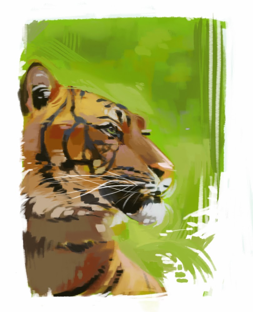
From last October. Some of these were made at Piazza Santa Croce (Florence), some while sitting on grass at the nearest park.


I tried to combine the fat tip of a Tombo marker and my usual Staedler fineliner, hunting for a different result. So:


  • It's a super fast combo - I can get shadows down quickly without actually drawing the outer lines, and the fineliner's thin tip fixes the general look. Very helpful if I need to practice on solid shading and strong contrast

  • Well, I suck at sketching buildings! :D 
  • So much sketching... and I can't seem to reduce the amount of linework yet


Experience gained: 3 points!
- I need to be more effective with less detail. I guess I'll pick up my notes from Louis Gonzales' workshop on gesture drawing - it was a gold mine
- I should train my eye with buildings and perspective - it's so intimidating to me, but this must be the right way to break the ice
- Blocking in shadows with a fat marker is a process I enjoy and will probably help me improve on many levels. It's fast, rough and unforgiving

    23.11.13

    Ski season

    Why do I crave snow so much?
    Speed painting from reference of Ovindoli, a mountain place I miss very much.
    All together now:
    - one brush
    - no color picking
    - no lineart


    • This took very little - between 10 and 15 minutes
    • Contrast looks a little better-managed than usual 

    • Those clouds suck, no matter how stylized they ended up looking
    • I'm not happy with the general feel of the textures. Time to make some good brushes


    Experience gained: 2 points!
    - I feel I need a "multiple strokes" brush. Scribbling with a single tip is fun and all, but I feel it doesn't simulate the effect I'm after well enough. I also need brushes that are better suited to painting environments - more texture, less control
    - I realized I have little to no experience with rendering clouds. Practice needed!

      19.11.13

      More naked people

      Beach and post office - what to do when you're bored as heck. 
      Summer was coming to an end :( 


      This batch of sketches was done during the same day as this one, so I guess there's nothing special to report in addition to what I wrote there.
      What? No I'm not lazy c:

      17.11.13

      Cutout

      I found the reference for this on Pinterest by typing "prostitute". Whut.
      Limitations: just one brush, no color picker (not so daunting when you have a greyscale ref :P), no preliminary skecth.
      Let see here - at some point I used the cutout filter on the refence: it simplifies the image by reducing the number of colors and making more or less complex adjacent patches out of them. You have control on edge fidelty and color complexity. I looked for something that could help me envision the values in definite areas.


      • I used the filter midway during the exercise and my patches of grey were quite close to what happened to the reference picture after the cutout. I wasn't expecting that!
      • I don't mind a rectangular, minimal background like that - I feel I'm getting a little more used to this kind of thing

      • I don't like the face. There's something wrong with the values and the patches of grey don't really deliver a good sense of  volume


      Experience gained: 2 points!
      - I need to practice more on painting faces and getting the volumes down in a few strokes. Speedpainting of faces from reference pics with a time limit should work - perhaps I could make 6 per day, 5 minutes each?
      - The cutout filter is a valuable tool. I'll definitely use it again to get a better grasp on synthesis

      14.11.13

      Hello watercolors

      Why hello - here's a watercolor sketch I made roughly two years ago. Finally introducing some colored traditional stuff! Now for the sad part: I haven't touched watercolors since this flamingo.


      Let's see here:


      • My beloved fineliner seems to cooperate with watercolors too. I'd like to try different media and/or ink colors for the line drawing part
      • It doesn't look too dull for a watercolor sketch

      • The face part looks confusing - too many details when a few wide blothes of color would have worked fine
      • Colors need to look more lively. I want to see more contrast (duh) and clash 
      • I probably worked with dirty water and slightly murky colors


      Experience gained: 4 points!
      - I want to practice more with mixing various media and watercolor. I like the outcome! I'll experiment with different ink colors, too
      - I need to work with wide areas of base color before jumping into details (its face D: )
      - Some consistent speedpainting from reference should help me manage tones and values better
      - Be clean, Dev. No murky water! You want your watercolor paintings to be bright

        11.11.13

        Overused

        Tigers are an easy choice when it comes to animal portraits but what can I say - they are such scenographic subjects.

        Same as last times: one brush, no color picker, no outlines. Analyzer mode: ON!


        • It seems that I'm moving towards more decorative solutions - the rough parallel scribbling in the background was spontaneous and doesn't look bad; those almost rectangular patches of fur seem to work nice; I think I'm improving with framing and cuts too - negative space foliage and fur look good, I'm gonna try that again with other subjects

        • Still struggling with contrast
        • I feel it's too soon to start tweaking colors - no trippy interpretations for now
        • I wanted it to look fine with bigger blotches of color and less detail


        Experience gained: 2 points!
        - I need to improve on synthesis. I should try shrinking and blurring the original reference picture, so as to be unable to go into details and forced to stick to the general impression
        - I'd love to get better at managing negative space and making it a part of my style

          9.11.13

          I miss the beach

          I decided to slow down and post three times per week. With the current post format posting WILL become more time-consuming, and with academy and all I guess I should focus on good in-depth posts instead of quantity :B

          So! here's a sketchbook page full of beach people from last summer. Some of them are amusing.


          • I'm glad I could use all the available space in the sheet. The year before I couldn't squeeze in as many sketches
          • Poses and shading seem to work fine - the bodies are less stiff than last time

          • The linework is often insecure and messy - NOT the good kind of messy
          • Anatomy and proportions, as always. I seem to struggle most with legs and sitting poses


          Experience gained: 3 points!
          - I don't mind a cluttered page. I lovelovelove saving space and drawing tiny helps me cope with fast-moving bad people
          - I definitely need to work on legs and hips structure
          - The lines are more complex and messy than last year. I can't tell if it's a good thing quite yet D: