Showing posts with label rough. Show all posts

4.11.14

Collecting dust

I have two neat Strathmore toned gray sketchbooks. They're collecting dust because...
Just because...?
Because I'm a wimp and I'm terrified of a brand new sketchbook that needs to be approached differently from what I'm used to do with my common white paper.
One day I felt especially daring and I decided to violate mr. Gray.

So a few weeks ago I found a nice reference photo in my folder (a very stereotypically handsome guy wearing make up - I was actually more interested in the lighting and the sharp cast shadows). My previous attempts at using charcoal were miserable, but here I realized what I was doing wrong.
I was holding and using the charcoal as if it were a pencil! Nice and tidy and precise.
Then I remembered something Shaddy Safadi said during one of his digital painting tutorial videos:
"Be bold!". Be bold with your strokes.
I dislike quoting people, and while the painting process was definitely interesting, I didn't agree with a bunch of things Shaddy said. But his explanation of what being bold means resonated with me.The moment I tried to hold the charcoal stick differently, the moment I said to myself "well who cares if this gets really rough and messy!" and meant it, a lot has changed.
I had fun!
I actually relaxed and enjoyed this new medium, how it can be rough and pasty, but also so soft. It allows me to shade in a way that feels so much more comfortable and natural and fast than pencil shading. I don't care if the outcome is any good. It is a big improvement since last time and I was so happy while I did it. 

So, what have we learned?
- BE. BOLD.
- I had fun dammit, this is a huge step forward!
- This took very little time. Not even one hour. No excuses: I can actually make one portrait like this every weekend almost without sacrificing time. One hour is nothing to an organized person. Which I'm trying to become.
- I AM capable of shutting my brain off. I can be bold and have fun without paranoias. It usually happens at random times, but it's a matter of time before I learn to control and re-create this state of mind.
- I can't flip the page (or use the skecthbook for that matter) until I buy a fixative because charcoal is going to smudge and get every fucking where on the back of the next page :D
- Hence the bad photo. I can't put this thing into a scanner.

2.10.14

Rediscovering

One step at a time!
I'll reconquer what I've lost. I'll tear away the inhibitions and embrace what I really love to draw.
But wishing won't make it happen, so I'm going to start a new sketchbook, which will be entirely devoted to free sketching. No intentional focus on improvement, no "pretty" refined stuff meant to be shown around without shame.
My secret letter to the embarrassing lover I never wanted my parents to meet; I'll have to pick up correspondence again if I ever hope to become comfortable with it.

I know I'm still able to slip into that who-cares state of mind.
Here's some stuff I did before summer. Quick thumbnails for an artbook cover.
I needed a predator to confront the human, or something symbolic, as helpless prey. I wanted it big, reptilian, fearsome, but I looked for "something else" at first because it would probably end up looking like a dragon. And dragons are mainstream, right? Sinful!
Still. I went ahead.


I enjoyed doing these. Oh so much. It was liberating. Quick and careless. It was the kind of subject I wanted on my cover.
That's what I'm after!
Ten minutes exploration of thumb n.2 for a more snowy feel. Pretty bad, but I didn't think of it at the time. Just exploring and having fun with cyan, magenta, big fearsome monster and ice. My favorite.

Further exploration of thumbnail 4. I was thinking of something graphic, with a plain white backgorund, but ended up painting the background as I realized the sky would have helped a ton in creating a definite mood. 

5.12.13

Watercolor week

An apple a day...
I've decided to start a simple training program to practice on the kind of stuff I need to improve on: one exercise from reference per day, for a week. I had a fun Watercolor Week and I plan to start a Clouds Week soon. 
Clouds are nasty. 

Speedsketching at the library


  • I'm proud I was brave enough to try my hand at interiors. Though the results are debatable
  • I'm getting a better handle on working with fast blotches of color and leaving white paper areas
  • Gestures aren't too stiff

  • Stuff looks sloppy without that black pen outline 
  • Something went wrong with the perspective down there. It's weird because I was very careful when sketching the scene - I must have relaxed too much and messed it up during the painting phase


Experience gained: 4 points!
- I MUST do this again, especially with interiors. The amount of skill and confidence gained when painting from life is extremely valuable. I need to think about color and light conditions on the spot and note things down for future reference!
- When geometric perspective is involved, do NOT paint until the sketch makes sense
- I'll mix in less water and more pigment. I need to manage strong, saturated color to make my sketches really expressive and bright and, most of all, not in need of a pen outline :v
- Drawing with a friend helps so much. It's incredible: I was always scared to show my stuff to others, but having someone to work with extensively helps exorcizing, in a way. I feel brave and careless and it's so new to me

    24.11.13

    Wintertime sketching

    From last October. Some of these were made at Piazza Santa Croce (Florence), some while sitting on grass at the nearest park.


    I tried to combine the fat tip of a Tombo marker and my usual Staedler fineliner, hunting for a different result. So:


    • It's a super fast combo - I can get shadows down quickly without actually drawing the outer lines, and the fineliner's thin tip fixes the general look. Very helpful if I need to practice on solid shading and strong contrast

    • Well, I suck at sketching buildings! :D 
    • So much sketching... and I can't seem to reduce the amount of linework yet


    Experience gained: 3 points!
    - I need to be more effective with less detail. I guess I'll pick up my notes from Louis Gonzales' workshop on gesture drawing - it was a gold mine
    - I should train my eye with buildings and perspective - it's so intimidating to me, but this must be the right way to break the ice
    - Blocking in shadows with a fat marker is a process I enjoy and will probably help me improve on many levels. It's fast, rough and unforgiving

      23.11.13

      Ski season

      Why do I crave snow so much?
      Speed painting from reference of Ovindoli, a mountain place I miss very much.
      All together now:
      - one brush
      - no color picking
      - no lineart


      • This took very little - between 10 and 15 minutes
      • Contrast looks a little better-managed than usual 

      • Those clouds suck, no matter how stylized they ended up looking
      • I'm not happy with the general feel of the textures. Time to make some good brushes


      Experience gained: 2 points!
      - I feel I need a "multiple strokes" brush. Scribbling with a single tip is fun and all, but I feel it doesn't simulate the effect I'm after well enough. I also need brushes that are better suited to painting environments - more texture, less control
      - I realized I have little to no experience with rendering clouds. Practice needed!

        19.11.13

        More naked people

        Beach and post office - what to do when you're bored as heck. 
        Summer was coming to an end :( 


        This batch of sketches was done during the same day as this one, so I guess there's nothing special to report in addition to what I wrote there.
        What? No I'm not lazy c:

        17.11.13

        Cutout

        I found the reference for this on Pinterest by typing "prostitute". Whut.
        Limitations: just one brush, no color picker (not so daunting when you have a greyscale ref :P), no preliminary skecth.
        Let see here - at some point I used the cutout filter on the refence: it simplifies the image by reducing the number of colors and making more or less complex adjacent patches out of them. You have control on edge fidelty and color complexity. I looked for something that could help me envision the values in definite areas.


        • I used the filter midway during the exercise and my patches of grey were quite close to what happened to the reference picture after the cutout. I wasn't expecting that!
        • I don't mind a rectangular, minimal background like that - I feel I'm getting a little more used to this kind of thing

        • I don't like the face. There's something wrong with the values and the patches of grey don't really deliver a good sense of  volume


        Experience gained: 2 points!
        - I need to practice more on painting faces and getting the volumes down in a few strokes. Speedpainting of faces from reference pics with a time limit should work - perhaps I could make 6 per day, 5 minutes each?
        - The cutout filter is a valuable tool. I'll definitely use it again to get a better grasp on synthesis

        11.11.13

        Overused

        Tigers are an easy choice when it comes to animal portraits but what can I say - they are such scenographic subjects.

        Same as last times: one brush, no color picker, no outlines. Analyzer mode: ON!


        • It seems that I'm moving towards more decorative solutions - the rough parallel scribbling in the background was spontaneous and doesn't look bad; those almost rectangular patches of fur seem to work nice; I think I'm improving with framing and cuts too - negative space foliage and fur look good, I'm gonna try that again with other subjects

        • Still struggling with contrast
        • I feel it's too soon to start tweaking colors - no trippy interpretations for now
        • I wanted it to look fine with bigger blotches of color and less detail


        Experience gained: 2 points!
        - I need to improve on synthesis. I should try shrinking and blurring the original reference picture, so as to be unable to go into details and forced to stick to the general impression
        - I'd love to get better at managing negative space and making it a part of my style

          9.11.13

          I miss the beach

          I decided to slow down and post three times per week. With the current post format posting WILL become more time-consuming, and with academy and all I guess I should focus on good in-depth posts instead of quantity :B

          So! here's a sketchbook page full of beach people from last summer. Some of them are amusing.


          • I'm glad I could use all the available space in the sheet. The year before I couldn't squeeze in as many sketches
          • Poses and shading seem to work fine - the bodies are less stiff than last time

          • The linework is often insecure and messy - NOT the good kind of messy
          • Anatomy and proportions, as always. I seem to struggle most with legs and sitting poses


          Experience gained: 3 points!
          - I don't mind a cluttered page. I lovelovelove saving space and drawing tiny helps me cope with fast-moving bad people
          - I definitely need to work on legs and hips structure
          - The lines are more complex and messy than last year. I can't tell if it's a good thing quite yet D:

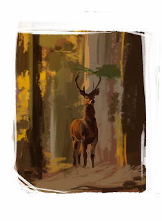
          4.11.13

          Standing on nothing

          Another speedpainting I did back in July. 
          Oh deer, you don't seem to be standing on very solid ground!

          Limitations:
          - no color picking
          - only use one hard brush
          - no lineart, sketching and such; apply color directly


          • Messy erasing on the edges looks interesting
          • The background is very rough and painterly but does look like forest. A bit
          • I managed to keep myself from touching up the background
          • I actually didn't use the picker at all this time around!
          • I can see I'd do much better now - this was from last July

          • I couldn't keep myself from touching up the damn deer
          • Speaking of which, it looks stiff and the neck is especially off
          • The deer looks really bad exactly where I went back with a smaller brush to "fix it"...
          • ...and it doesn't seem to be stading on the ground. The problem was that bunch of branches/stray that cover its feet: in the picture it's actually a lot closer to the viewer and out of focus, so the deer's shadow wasn't visible and I couldn't really deliver a sense of distance
          •  The colors aren't fresh and bright as they're supposed to


          Experience gained: X points!
          - Work work work on freshness and brightness of colors, perhaps even pushing values and saturation a bit
          - Do NOT zoom in and go small brush on speedpainting like these - I need to work with large solid blotches of color and get better at being expressive with few strokes 
          - Do NOT go for details if the base stucture is wrong 

          3.11.13

          I definitely need a hand

          Part two of my brief but intense hands session.


          Some improvement here, I think.


          • Anatomical accuracy and technique improved since the last batch 
          • Midtones look better 
          • The inking style is a little on the decorative side - I'd like to keep like those "patches" of parallel lines

          • Those hands would look overdetailed on a full illustration in this style - the illustration itself would look stupidly overdetailed in this style
          • I'm still far from a decent decorative solution 


          Experience gained: 2 points!
          - I'm going to try with some better thought-out hatching. I'd like the strokes' direction to be actually based on the surface of the object and how its "facets" tilt
          - I realized I need some background color to make the "lineless-with-shadows" idea work - or, as "background", what should be part of a full illustration besides hands :v

            2.11.13

            Need a hand?

             Hands are evil and since my last exam I realized more than ever I lack some real knowledge of their structure. So in July I gathered some reference pics and produced some quick practice sketches.


            Staedtler fineliner and Copic markers - I was coming from a week or more without grabbing a pencil (or pen tablet) and my strokes were ugly and unconfident and hairy ugh.

            I used my trusty fineliner and the fat brush tip of a black Tombo marker on this one.
            Let's see:


            Image Hosted by ImageShack.us

            • Fat black marker and fineliner are great for quick sketching
            • I improved a lot by making more and more of these - the next batch looks a lot better!
            Image Hosted by ImageShack.us

            • Fingers often look off
            • Not drawing for a while is bad. It shows
            •  This first batch of marker & fineliner sketches look horrible. The black areas are unrefined and uneffective
            • Those parallel fine lines as midtones look awful  

            Image Hosted by ImageShack.us 

            Experience gained: 4 points!
            - I've been having issues on this. I need to draw hands more often and study muscles and bones properly
            - Tombo and fineliner are great mediums I'll definitely use again to get more confident on large shadow areas
            - I'd like my inked stuff to look good without those outlines that are exposed to light. In other words, I'd like to find a solution to make subjects look believable by just inking shadows and a little hint of midtones, without the need for outlines
            - I need a solution for midtones. I can't figure out how to reproduce them properly when using inks yet


            31.10.13

            Pearboobs

            Meet pearboobs.
            This lady was my first practice digital speedpainting from reference.
            Limitations:
            - no color picking
            - only use one hard brush
            - no lineart, sketching and such; apply color directly

            So...

            Image Hosted by ImageShack.us

            • I finally found a comfortable solid brush for speedpainting - hard, flat, sliiigthly texturized. Check out the next post, "Brush test" 
            • The limitations are helping a lot in learning how to get colors right and honing proportions
            • I started noticing I don't like the framing and those edges being so randomly chopped off
            Image Hosted by ImageShack.us

            •  The framing is bad - I stuck to the reference picture, but I need to find a better solution
            • Low contrast, again
            • Many traits and proportions aren't as accurate as hey should be
            • I did use the picker a couple times, but I swear I've dropped it completely since this speedpainting D:

            Image Hosted by ImageShack.us

            Experience gained: 3 points!
            - Still need to work on smiles and expression lines 
            - No more color picker. Never again! 
            - Framing and composition need some planning - I could try to cut off some parts of the background and only paint patches of it in a relatively small spot behind the character, so as to contextualize it without extending the background completely

            29.10.13

            Outdoors speedpainting

            Grabbed my laptop, sat under a tree and speedpainted what I saw. This was my first excercise of this kind and I improved a lot since then.
            I'm still not happy with my landscapes and similar things, but this first attempt sucks big time compared to the latest crap :D
            Let's break it down:


            Image Hosted by ImageShack.us

            • Although I couldn't use any form of color picking, the colors came out quite faithful
            • The building looks more solid than I expected, for someting I painted with a soft brush with a lot of Transfer
            Image Hosted by ImageShack.us

            • Soft brushes: they are BAD for this kind of things. In my experience, that is
            • Those tiles are horrible - that soft brush didn't help
            •  I'm seriously bad at stylizing foliage


            Experience gained: 4 points!
            - I'll avoid soft brushes for environments and speedpainting in general; solid ones help block out volumes fast and find new graphic solutions
            - I need to create some good brushes with which to paint foliage effectively...
            - ... AND practice on drawing and painting foliage without them!
            - My environments need more contrast - something to keep in mind during next painting sessions