Showing posts with label color. Show all posts

2.10.14

Rediscovering

One step at a time!
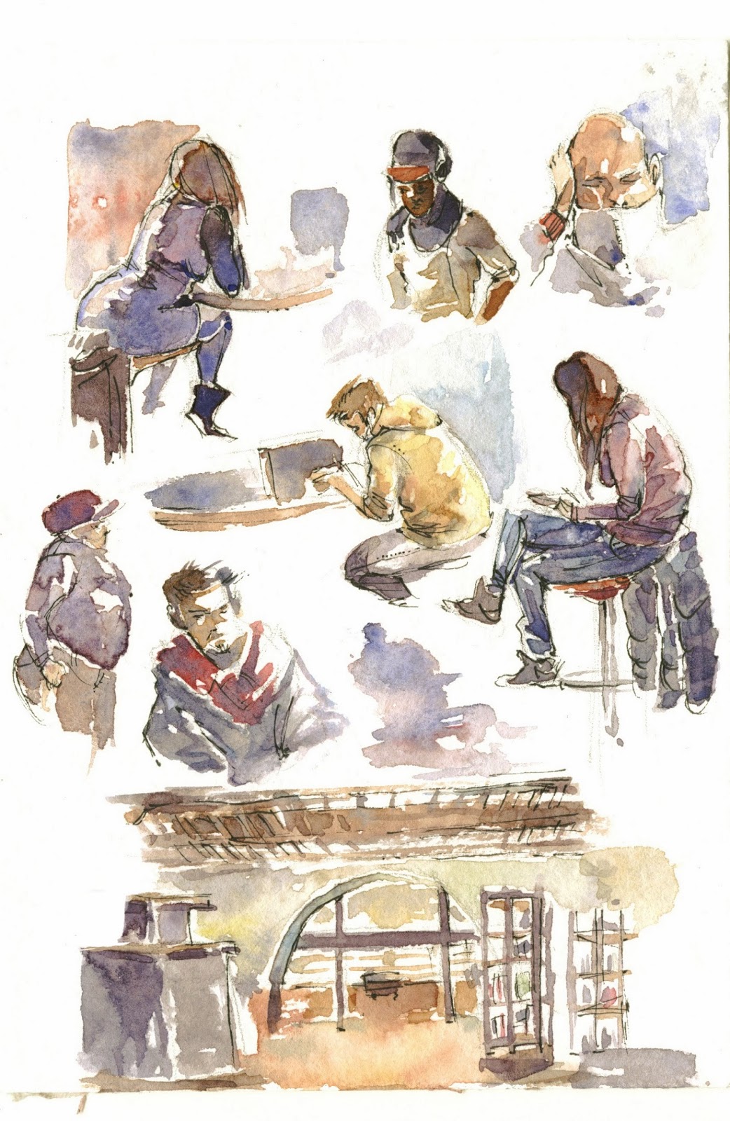
I'll reconquer what I've lost. I'll tear away the inhibitions and embrace what I really love to draw.
But wishing won't make it happen, so I'm going to start a new sketchbook, which will be entirely devoted to free sketching. No intentional focus on improvement, no "pretty" refined stuff meant to be shown around without shame.
My secret letter to the embarrassing lover I never wanted my parents to meet; I'll have to pick up correspondence again if I ever hope to become comfortable with it.

I know I'm still able to slip into that who-cares state of mind.
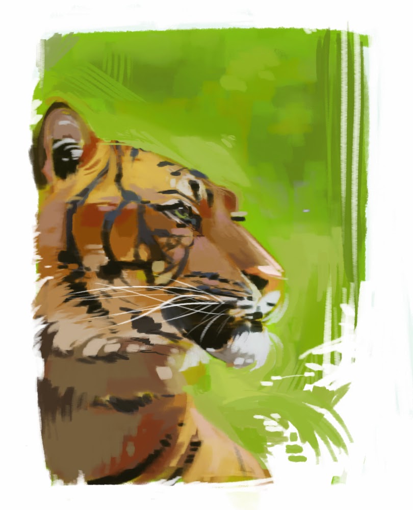
Here's some stuff I did before summer. Quick thumbnails for an artbook cover.
I needed a predator to confront the human, or something symbolic, as helpless prey. I wanted it big, reptilian, fearsome, but I looked for "something else" at first because it would probably end up looking like a dragon. And dragons are mainstream, right? Sinful!
Still. I went ahead.


I enjoyed doing these. Oh so much. It was liberating. Quick and careless. It was the kind of subject I wanted on my cover.
That's what I'm after!
Ten minutes exploration of thumb n.2 for a more snowy feel. Pretty bad, but I didn't think of it at the time. Just exploring and having fun with cyan, magenta, big fearsome monster and ice. My favorite.

Further exploration of thumbnail 4. I was thinking of something graphic, with a plain white backgorund, but ended up painting the background as I realized the sky would have helped a ton in creating a definite mood. 

23.9.14

Park test

On to the equipment!
I sat down and did a quick study of my backpack and bag. Might as well practice at drawing inanimate objects, which I've been ignoring for most of my life. It shows.


My cellphone was in my pocket and my money & documents were tucked away in my bag: they were virtually weightless and I didn't count them in the overall weight.
Both pieces were very small and light and I could barely feel the pack on my shoulders. Splitting the weight was a good move, especially if I can avoid having it all on one shoulder. My spine thanks me kindly.
Finding stuff was not confusing because everything I needed to use often was in my shoulder bag.
Although. The ideal condition would be dumping the unnecessary and only have one bag with me.
A waist bag would be perfect, too bad I don't have one big enough.
Until then, we'll see how I can refine my packing strategies so that my back doesn't get hurt and the stuff I need is ready to be plucked out of the bag at any moment - which is not going to happen if I'm only carrying a backpack.

Anyway, I sat down again and tried to paint the meadow and ruins in front of me. I know I have a problem with large, deep fields of a single color. I struggle with depth.


Yay. Just one week before I'm finally able to replace my old scanner

I had a hard time beginning this because I couldn't place the objects correctly. I needed to frame the scene with my hands and then my camera to see it more clearly! Sheesh.
There was a hint of blue sky, but my scanner is flipping the bird at me and some color and detail got lost. I have a couple ideas to make this thing better next time:
- I should choose a place where foreground, middleground and background are more evident. I feel the need for a foreground to frame the image
- Perhaps a path in the grass, going off to the background, could help communicate better perspective and depth?
- I'll use a dry brush (or I'll use the brush sideways) to get a more randomic, leafy shape for the trees

There were lots of huge colonies of those cute red "little devils", as we call them. I noticed there was a more slender, "tattooed" type and a fatty variant with less black markings. I thought it was because of gender (especially funny considering the rounder variant has some kind of bikini top marking!), but turns out the fully tattooed ones are adults, while the others are not fully developed.


Firebugs. Firebugs everywhere.
And this was the smallest patch I could find.

I didn't do much more. I had a fast walk, some stretching and a good book. The bag and backpack never felt heavy, so I guess I can go ahead and try a proper field trip.
I noticed I didn't feel comfortable using the gray sketchbook for landscape sketching, and I might as well bring less pencils with me anyway. I should be able to reduce the weight if I focus on watercolor only, and I prefer copics to pencils for gesture drawing and tonal sketches.
That's all for today!

17.9.14

Plein air

Lack of motivation hits hard, but I've got to the core of the problem.
I'm setting two new goals for myself, and boy do I need to achieve them for my own well-being.
I'll talk about it later - now have some watercolor stuff I painted on the spot.


Prunus log. My grandma's garden in the countryside is always my favorite place to be when I need a break from technology.
Still flat, but I feel I'm improving in rendering volumes and textures in watercolors.

A red house I could see from the balcony at my grandmother's house. A sudden storm drove me away sooner than I hoped. I struggle with trees A LOT. I'm so inexperienced at drawing buildings, but I'm starting to put more time and effort into the sketching phase. I really can't afford to paint directly with such an alien subject.

A sleepy old man I sketched on the train and painted later while relaxing in Verona with my boyfriend. Lovely trip if somewhat short!
This was painted on bad generic sketchbook paper so yeah, the texture sucks and the colors look so dead. Watercolor paper is so expensive


15.12.13

Ugh

Currently fighting with school stuff - have a quick cloud painting practice.


Analysis will come later, as soon as I manage to breathe :v

5.12.13

Watercolor week

An apple a day...
I've decided to start a simple training program to practice on the kind of stuff I need to improve on: one exercise from reference per day, for a week. I had a fun Watercolor Week and I plan to start a Clouds Week soon. 
Clouds are nasty. 

Speedsketching at the library


  • I'm proud I was brave enough to try my hand at interiors. Though the results are debatable
  • I'm getting a better handle on working with fast blotches of color and leaving white paper areas
  • Gestures aren't too stiff

  • Stuff looks sloppy without that black pen outline 
  • Something went wrong with the perspective down there. It's weird because I was very careful when sketching the scene - I must have relaxed too much and messed it up during the painting phase


Experience gained: 4 points!
- I MUST do this again, especially with interiors. The amount of skill and confidence gained when painting from life is extremely valuable. I need to think about color and light conditions on the spot and note things down for future reference!
- When geometric perspective is involved, do NOT paint until the sketch makes sense
- I'll mix in less water and more pigment. I need to manage strong, saturated color to make my sketches really expressive and bright and, most of all, not in need of a pen outline :v
- Drawing with a friend helps so much. It's incredible: I was always scared to show my stuff to others, but having someone to work with extensively helps exorcizing, in a way. I feel brave and careless and it's so new to me

    23.11.13

    Ski season

    Why do I crave snow so much?
    Speed painting from reference of Ovindoli, a mountain place I miss very much.
    All together now:
    - one brush
    - no color picking
    - no lineart


    • This took very little - between 10 and 15 minutes
    • Contrast looks a little better-managed than usual 

    • Those clouds suck, no matter how stylized they ended up looking
    • I'm not happy with the general feel of the textures. Time to make some good brushes


    Experience gained: 2 points!
    - I feel I need a "multiple strokes" brush. Scribbling with a single tip is fun and all, but I feel it doesn't simulate the effect I'm after well enough. I also need brushes that are better suited to painting environments - more texture, less control
    - I realized I have little to no experience with rendering clouds. Practice needed!

      14.11.13

      Hello watercolors

      Why hello - here's a watercolor sketch I made roughly two years ago. Finally introducing some colored traditional stuff! Now for the sad part: I haven't touched watercolors since this flamingo.


      Let's see here:


      • My beloved fineliner seems to cooperate with watercolors too. I'd like to try different media and/or ink colors for the line drawing part
      • It doesn't look too dull for a watercolor sketch

      • The face part looks confusing - too many details when a few wide blothes of color would have worked fine
      • Colors need to look more lively. I want to see more contrast (duh) and clash 
      • I probably worked with dirty water and slightly murky colors


      Experience gained: 4 points!
      - I want to practice more with mixing various media and watercolor. I like the outcome! I'll experiment with different ink colors, too
      - I need to work with wide areas of base color before jumping into details (its face D: )
      - Some consistent speedpainting from reference should help me manage tones and values better
      - Be clean, Dev. No murky water! You want your watercolor paintings to be bright

        11.11.13

        Overused

        Tigers are an easy choice when it comes to animal portraits but what can I say - they are such scenographic subjects.

        Same as last times: one brush, no color picker, no outlines. Analyzer mode: ON!


        • It seems that I'm moving towards more decorative solutions - the rough parallel scribbling in the background was spontaneous and doesn't look bad; those almost rectangular patches of fur seem to work nice; I think I'm improving with framing and cuts too - negative space foliage and fur look good, I'm gonna try that again with other subjects

        • Still struggling with contrast
        • I feel it's too soon to start tweaking colors - no trippy interpretations for now
        • I wanted it to look fine with bigger blotches of color and less detail


        Experience gained: 2 points!
        - I need to improve on synthesis. I should try shrinking and blurring the original reference picture, so as to be unable to go into details and forced to stick to the general impression
        - I'd love to get better at managing negative space and making it a part of my style

          4.11.13

          Standing on nothing

          Another speedpainting I did back in July. 
          Oh deer, you don't seem to be standing on very solid ground!

          Limitations:
          - no color picking
          - only use one hard brush
          - no lineart, sketching and such; apply color directly


          • Messy erasing on the edges looks interesting
          • The background is very rough and painterly but does look like forest. A bit
          • I managed to keep myself from touching up the background
          • I actually didn't use the picker at all this time around!
          • I can see I'd do much better now - this was from last July

          • I couldn't keep myself from touching up the damn deer
          • Speaking of which, it looks stiff and the neck is especially off
          • The deer looks really bad exactly where I went back with a smaller brush to "fix it"...
          • ...and it doesn't seem to be stading on the ground. The problem was that bunch of branches/stray that cover its feet: in the picture it's actually a lot closer to the viewer and out of focus, so the deer's shadow wasn't visible and I couldn't really deliver a sense of distance
          •  The colors aren't fresh and bright as they're supposed to


          Experience gained: X points!
          - Work work work on freshness and brightness of colors, perhaps even pushing values and saturation a bit
          - Do NOT zoom in and go small brush on speedpainting like these - I need to work with large solid blotches of color and get better at being expressive with few strokes 
          - Do NOT go for details if the base stucture is wrong 

          31.10.13

          Pearboobs

          Meet pearboobs.
          This lady was my first practice digital speedpainting from reference.
          Limitations:
          - no color picking
          - only use one hard brush
          - no lineart, sketching and such; apply color directly

          So...

          Image Hosted by ImageShack.us

          • I finally found a comfortable solid brush for speedpainting - hard, flat, sliiigthly texturized. Check out the next post, "Brush test" 
          • The limitations are helping a lot in learning how to get colors right and honing proportions
          • I started noticing I don't like the framing and those edges being so randomly chopped off
          Image Hosted by ImageShack.us

          •  The framing is bad - I stuck to the reference picture, but I need to find a better solution
          • Low contrast, again
          • Many traits and proportions aren't as accurate as hey should be
          • I did use the picker a couple times, but I swear I've dropped it completely since this speedpainting D:

          Image Hosted by ImageShack.us

          Experience gained: 3 points!
          - Still need to work on smiles and expression lines 
          - No more color picker. Never again! 
          - Framing and composition need some planning - I could try to cut off some parts of the background and only paint patches of it in a relatively small spot behind the character, so as to contextualize it without extending the background completely

          29.10.13

          Outdoors speedpainting

          Grabbed my laptop, sat under a tree and speedpainted what I saw. This was my first excercise of this kind and I improved a lot since then.
          I'm still not happy with my landscapes and similar things, but this first attempt sucks big time compared to the latest crap :D
          Let's break it down:


          Image Hosted by ImageShack.us

          • Although I couldn't use any form of color picking, the colors came out quite faithful
          • The building looks more solid than I expected, for someting I painted with a soft brush with a lot of Transfer
          Image Hosted by ImageShack.us

          • Soft brushes: they are BAD for this kind of things. In my experience, that is
          • Those tiles are horrible - that soft brush didn't help
          •  I'm seriously bad at stylizing foliage


          Experience gained: 4 points!
          - I'll avoid soft brushes for environments and speedpainting in general; solid ones help block out volumes fast and find new graphic solutions
          - I need to create some good brushes with which to paint foliage effectively...
          - ... AND practice on drawing and painting foliage without them!
          - My environments need more contrast - something to keep in mind during next painting sessions