Tigers are an easy choice when it comes to animal portraits but what can I say - they are such scenographic subjects.
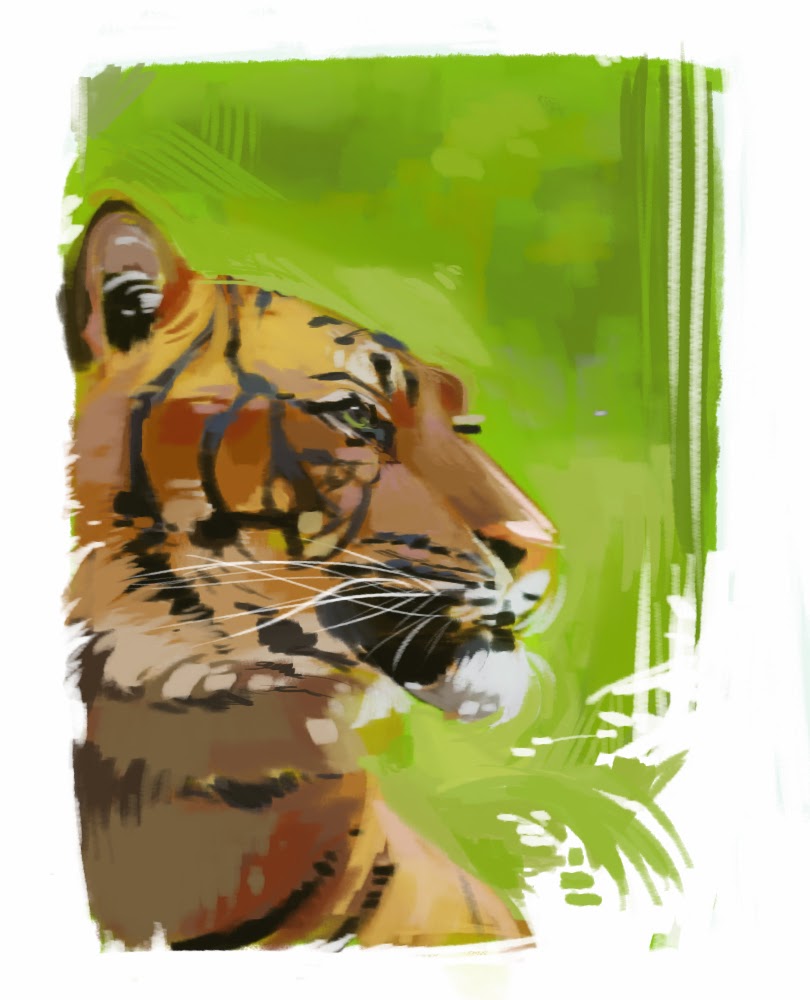

- It seems that I'm moving towards more decorative solutions - the rough parallel scribbling in the background was spontaneous and doesn't look bad; those almost rectangular patches of fur seem to work nice; I think I'm improving with framing and cuts too - negative space foliage and fur look good, I'm gonna try that again with other subjects

- Still struggling with contrast
- I feel it's too soon to start tweaking colors - no trippy interpretations for now
- I wanted it to look fine with bigger blotches of color and less detail

Experience gained: 2 points!
- I need to improve on synthesis. I should try shrinking and blurring the original reference picture, so as to be unable to go into details and forced to stick to the general impression
- I'd love to get better at managing negative space and making it a part of my style
- I'd love to get better at managing negative space and making it a part of my style
No comments:
Post a Comment